Crossing Cultures
Ralston Crawford, Vilcek Foundation

Ralston Crawford is an artist best known for his Precisionist work in the 1930s and ‘40s, but there is much less knowledge of his work beyond those years. It is not every day that an artist is given a true reassessment, but luckily, the Vilcek Foundation in New York City has managed to do just that. Titled Torn Signs, Crawford’s late work is a showcase in cross-cultural influences. As an avid traveler and observer, the artist absorbed many new experiences and traditions. Rather than the sleek, mechanical works that Crawford made before World War II, the pieces in this exhibition achieve radiate emotion, warmth, and beauty.
The first aspect of this exhibition worth discussing is the institution that created this show. The Vilcek Foundation was created in order to celebrate, exhibit, and award immigrants for their contributions to America’s arts and sciences (all worthy causes at this moment in history.) Upon first glance, Crawford may seem like an odd choice, since he is mostly associated with the ultra-American Precisionist style. However, Crawford was Canadian, and frequently moved and traveled in the United States and abroad. As one makes their way through this exhibition, it becomes clear that Crawford’s work was influenced by many more factors than just one artist or culture.
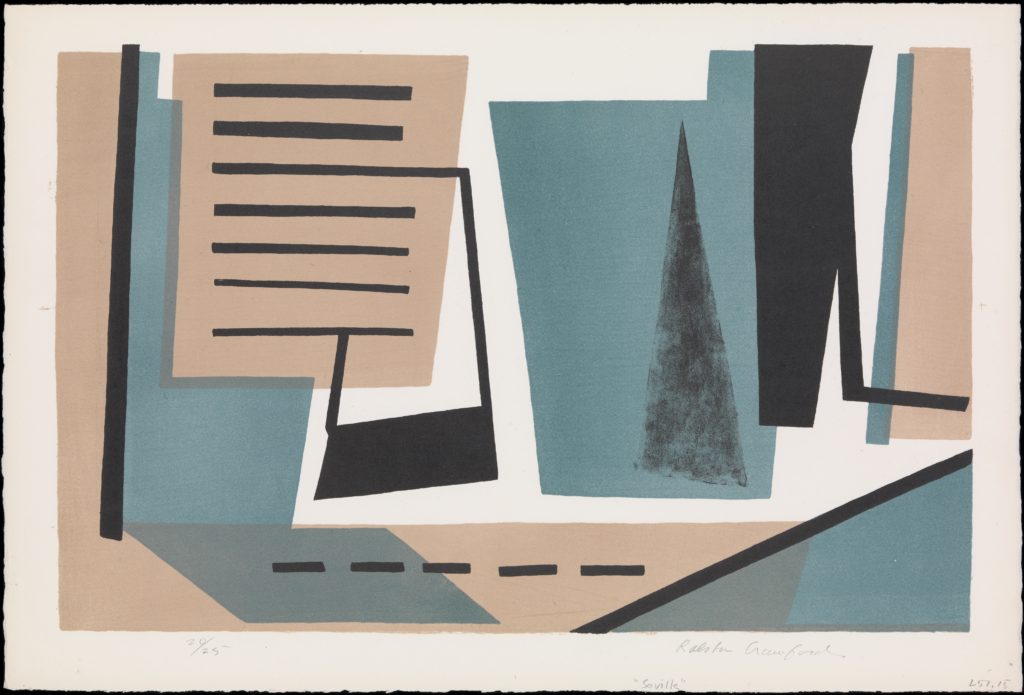
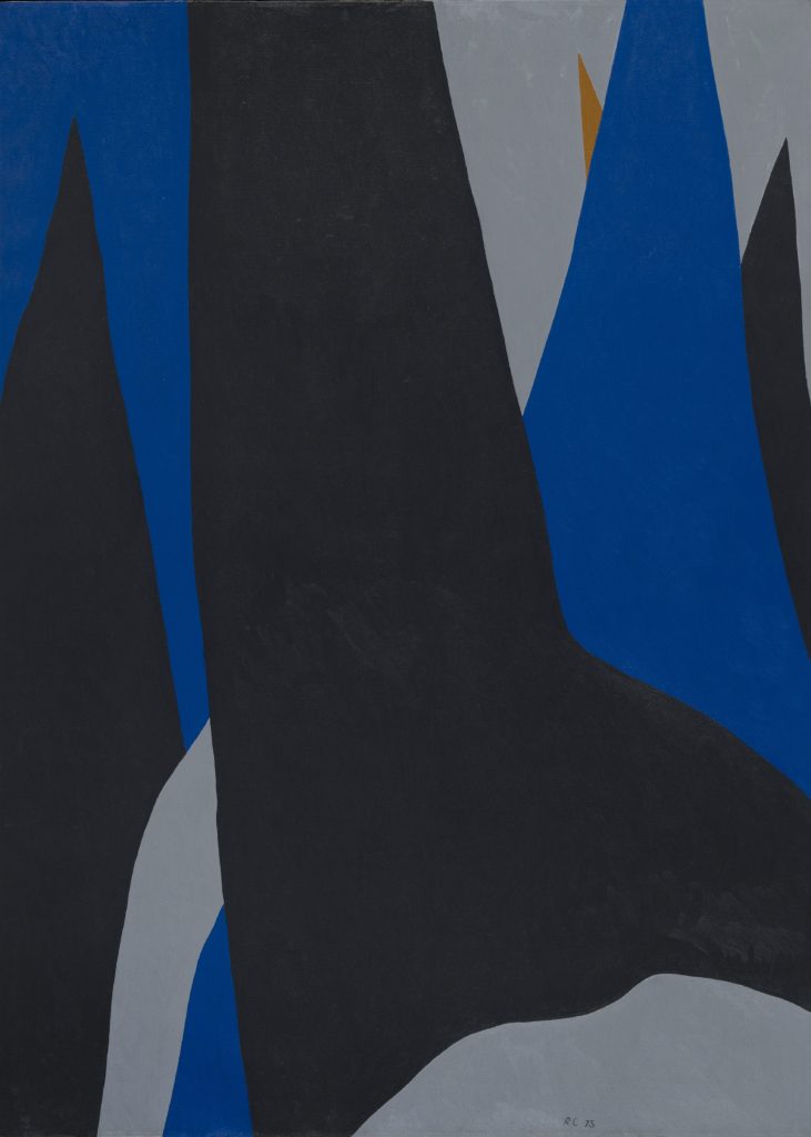
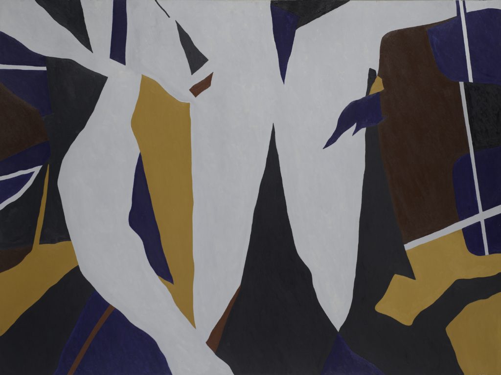
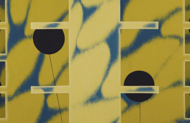
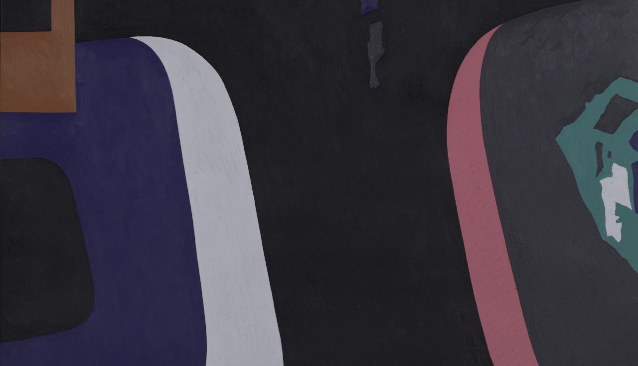
Crawford always traveled. Before receiving any degrees, he had lived in Ontario, New York, California, and Pennsylvania. Later, he went on to experience things that seemingly had little to do with visual art: jazz in New Orleans, bullfights and Catholic ceremonies in Spain, and even a nuclear bomb test in the southern Pacific. However, this made all the difference on his work. Before World War II, Crawford was making work in nearly the same style as Charles Sheeler, but there was a noticeable shift by the 1950s. Suddenly, the prints and paintings the artist was producing were much more abstract. Unlike the American Ab-Ex painters, Crawford seemingly embraced a more European vision of abstraction. In Seville, a print from 1957, there are Cubist echoes of Juan Gris or Picasso. The title Seville seems even more apt when considering the artistic forefathers of Crawford’s style during this period.
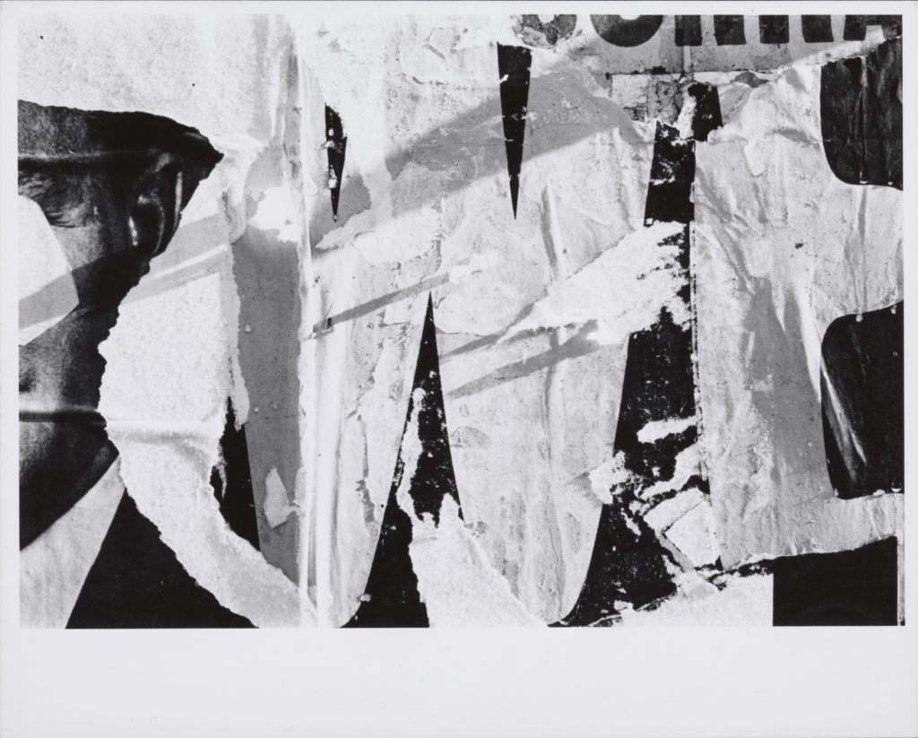
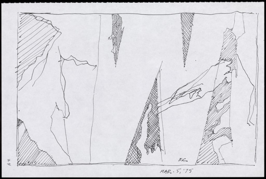
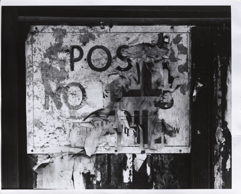
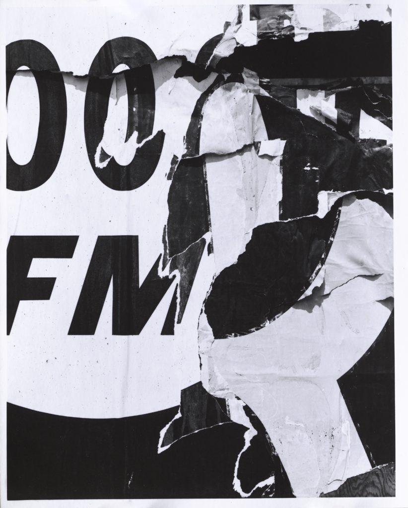
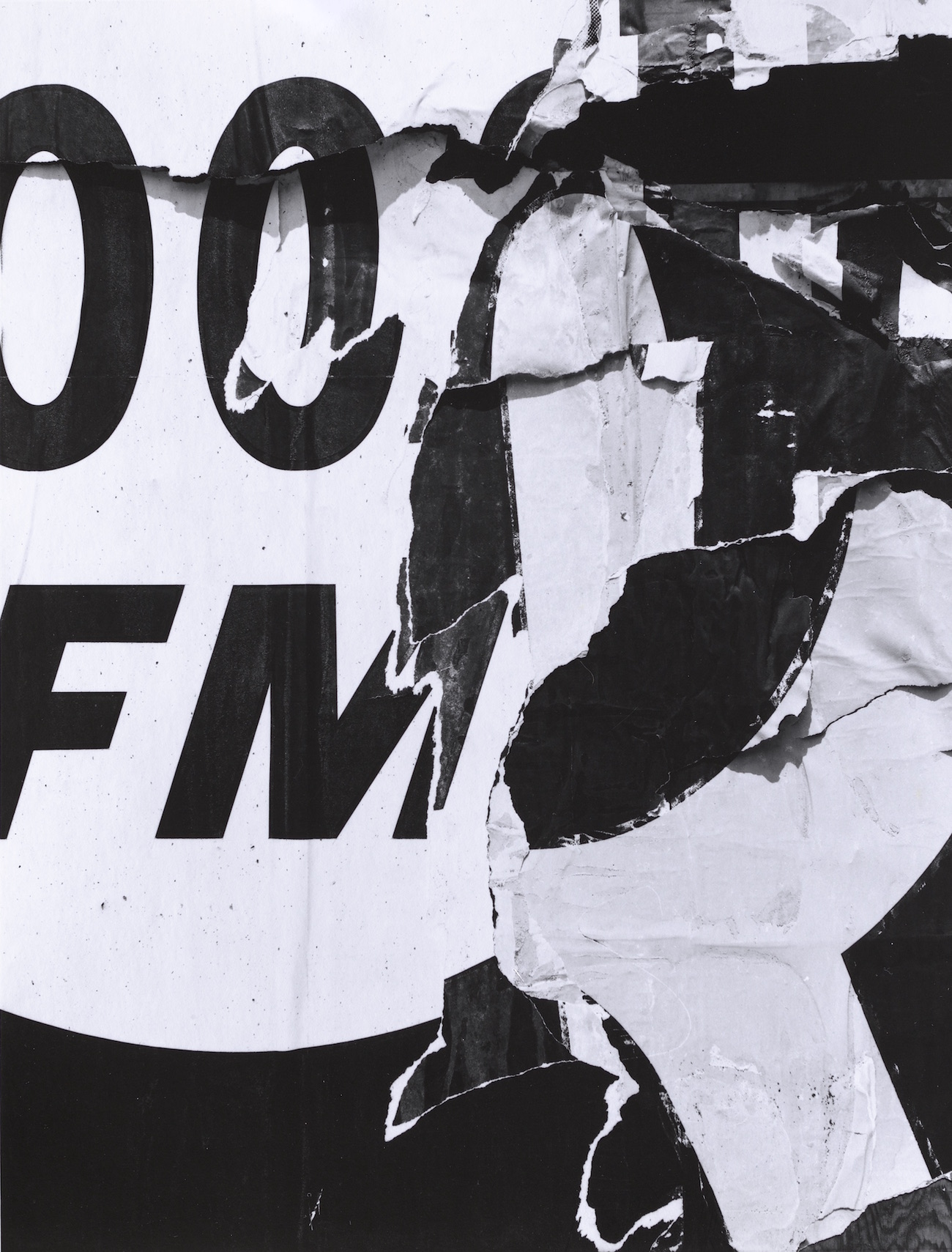
Accompanying many of these prints and paintings are photographs. Torn up layers of advertisements and signs found in various cities echo Crawford’s paintings of the 1970s. Others show the intimidating and Baroque Catholic services in Spain, which show hooded figures looming in the crowd. These triangular hoods make their way into paintings like Procession #2 from 1973 or Seville from 1975, where religious or historic imagery and the architecture of the Old World are sublimated into sleekly edited forms. These compositions move with colors that range from vivid to brooding, and each painting skillfully evokes emotion through Crawford’s palette.
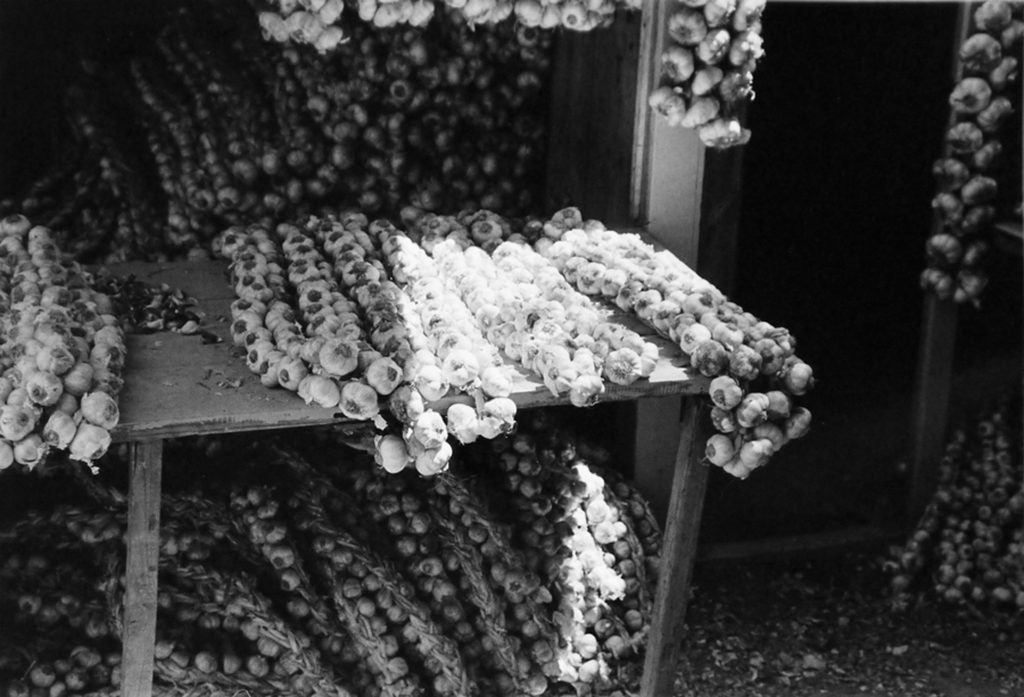
With these pairings, we are given direct links to the connections Crawford made during sojourns, whether it was a vignette found in an ordinary street market or solemn religious rite. Crawford moved beyond the Machine Age and into something that was seemingly more satisfying and soul-enriching.